BRAZILY
04When Brazily's first iOS app was rejected by the App Store, the easy read was 'fix the policy violations.' The harder, more valuable read was that the app reproduced the same problem the web platform already had: a freemium model that was invisible in the UI, and no orientation path for new users. This case study is about the decisions that fixed that, and the AI-augmented workflow that let me explore them faster and more rigorously than the timeline should have allowed.

I owned the design across onboarding, dashboard, and course discovery, partnering with Cait Dai on competitor and market research and wireframe refinements.
Brazily Fitness's first iOS app was rejected by the App Store. Built on a web view-based tool, it hit Apple's policy restrictions before a single user could download it. That rejection forced a conversation around building a real native app, and created an opportunity to fix what wasn't working underneath too.
Despite strong content and an engaged community, mobile bounce rates were high. The freemium model was invisible in the UI, and with membership managed entirely off-platform, the interface had no way to sell it, only to make it legible. New visitors had no orientation path. The drop-off problem wasn't content quality, it was navigation.
This case study focuses less on the design decisions themselves and more on how I worked: specifically, how I used Claude, Claude Code, and Figma MCP to run a faster, more rigorous, and more iterative process than I could have otherwise.
Finding the real problem
I ran a full platform audit, a competitor analysis across Zumba and SHiNE Dance Fitness, and a synthesis of user behavior patterns. Using the competitor-analysis skill, Claude helped me move from raw observations to a structured framework that surfaced design gaps, compressing what would otherwise be several working sessions into one focused output I could act on and present to the client.
The finding that shaped everything: the drop-off problem was navigation, not content quality. Users couldn't orient themselves. The platform expected users to arrive with a mental model they hadn't been given.
Building the infrastructure first
Before the first screen was designed, I built a set of custom and reusable Claude skills, that I now carry into every engagement.
A custom instruction set that defines how Claude should behave for a specific type of task. It encodes the methodology, fidelity standards, notation rules, and design principles for a specific type of task.
Defines layout logic, content hierarchy, and fidelity level for mobile screens. Rather than producing generic placeholders, it generates layouts that match the project's navigation architecture and content model, with realistic labels and interaction states.
Keeps iterative screen work grounded in established project decisions. When working through multiple screen variations in a single session, this skill ensures each iteration builds on what was decided before rather than drifting or restarting from defaults.
Structures competitive findings into UX-relevant gaps rather than simple feature comparisons. It produces analysis around what each platform fails to do for the user, which is the actual useful output for design decision-making.
Shapes usability findings into a stakeholder-ready narrative. It prioritizes findings by severity, connects observations to design implications, and frames everything in language a client without a design background can evaluate and respond to.
Ensures any HTML/CSS output generated meets a quality bar for visual structure, hierarchy, and layout logic. This is essential for wireframe exploration, where generated screens need to be evaluable as real options, not just functional markup.
I've open-sourced all of these skills so other designers can use and build on them.


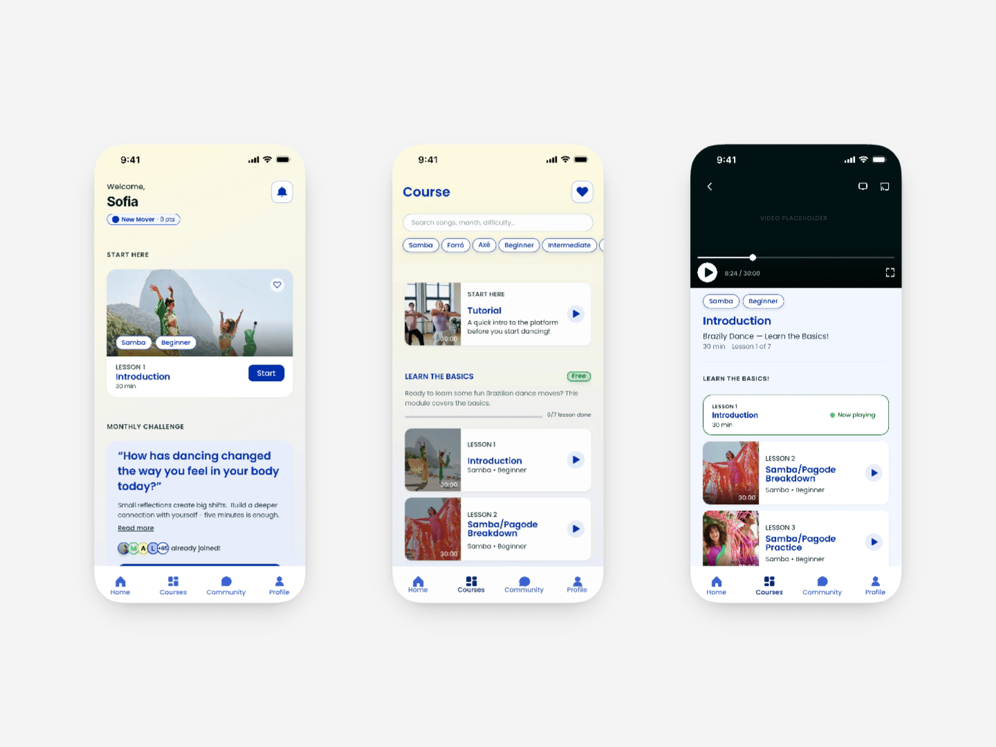
From dashboard, passing to courses tab, to the actual video lesson.
The “Course” screen is where the most consequential design work happened.
The original platform didn't organize content: users who came through a direct link weren't aware of membership-exclusive content, and the ones that did had a hard time finding it.
After creating a user-friendly path to courses, I explored organizing content by dance style with free and locked classes coexisting within each section. The logic was sound: users come to Brazily to learn a specific style, not for a tier structure. But the owner pushed back: the sequence of videos matters to how the content is taught, and breaking it apart by style would disrupt that progression.
The final model kept the open layout with all lessons visible, grouped by course (March 2026, April 2026), preserving the pedagogical order while still solving the original problem: users could see what was available, what was accessible, and where they were in the content. And because the app couldn't sell membership (that lived in GoHighLevel, off-platform), making the model visible wasn't a nice-to-have, it was the only lever I had. The open, course-grouped layout surfaced the freemium structure for the first time: not as a sales prompt, but as orientation.
Navigation architecture followed the same logic: single scroll, no tabs, with a chip row for filtering. Simple enough for a new visitor, functional enough for an active member.
To explore visual direction, I used the wireframe-generator and frontend-design skills with Claude Code and Figma MCP to generate different hypotheses about how to balance content density, brand, and navigability, choosing between three real options on the same afternoon.
The constraints that shaped the build
This app didn't exist in isolation. It sat on top of a backend I didn't own and a platform with hard rules, and those constraints shaped the design more than any aesthetic choice did.
Why native, not a wrapper. The first submission was a webview build, essentially the website in an app shell. Apple rejects those under Guideline 4.2 (Minimum Functionality), and an SSO conflict between the wrapper and the membership backend compounded it. Rebuilding as a genuinely native app wasn't a preference; it was the only path to the store, and it's what made the rest of the redesign possible.
Membership the app couldn't sell. Membership lived in GoHighLevel, the client's existing backend, and replacing it was out of scope. So the problem was never ‘add a buy button.’ It was making an externally-managed membership legible inside the app: showing what was free, what was locked, and routing cleanly to the web for purchase without the app transacting, a multiplatform-access model that keeps the app clean of in-app-purchase entanglement.
The auth handoff. A member who subscribed on brazily.com still has to be recognized inside the app, and the original build had failed partly on exactly this. With three user types holding different permissions, I designed onboarding and access logic around that handoff, rather than around an in-app signup that doesn't exist.
Account deletion, by requirement. Guideline 5.1.1(v) requires any app supporting account creation to offer in-app account deletion. Even with membership managed externally, that meant designing a deletion flow into the account architecture, surfaced as a clear, findable path rather than buried, because the requirement is about user control, not box-ticking.
Progress on real watch state. Course completion was tied to actual playback, not self-report, so the progress UI had to reflect viewing data directly, a small decision about the data model with a direct consequence for how ‘pick up where you left off’ behaved across the dashboard and course screens.
Knowing where these lines sit (what the platform enforces, what the backend dictates) is what let me hand a developer something buildable, not just something that looked right.
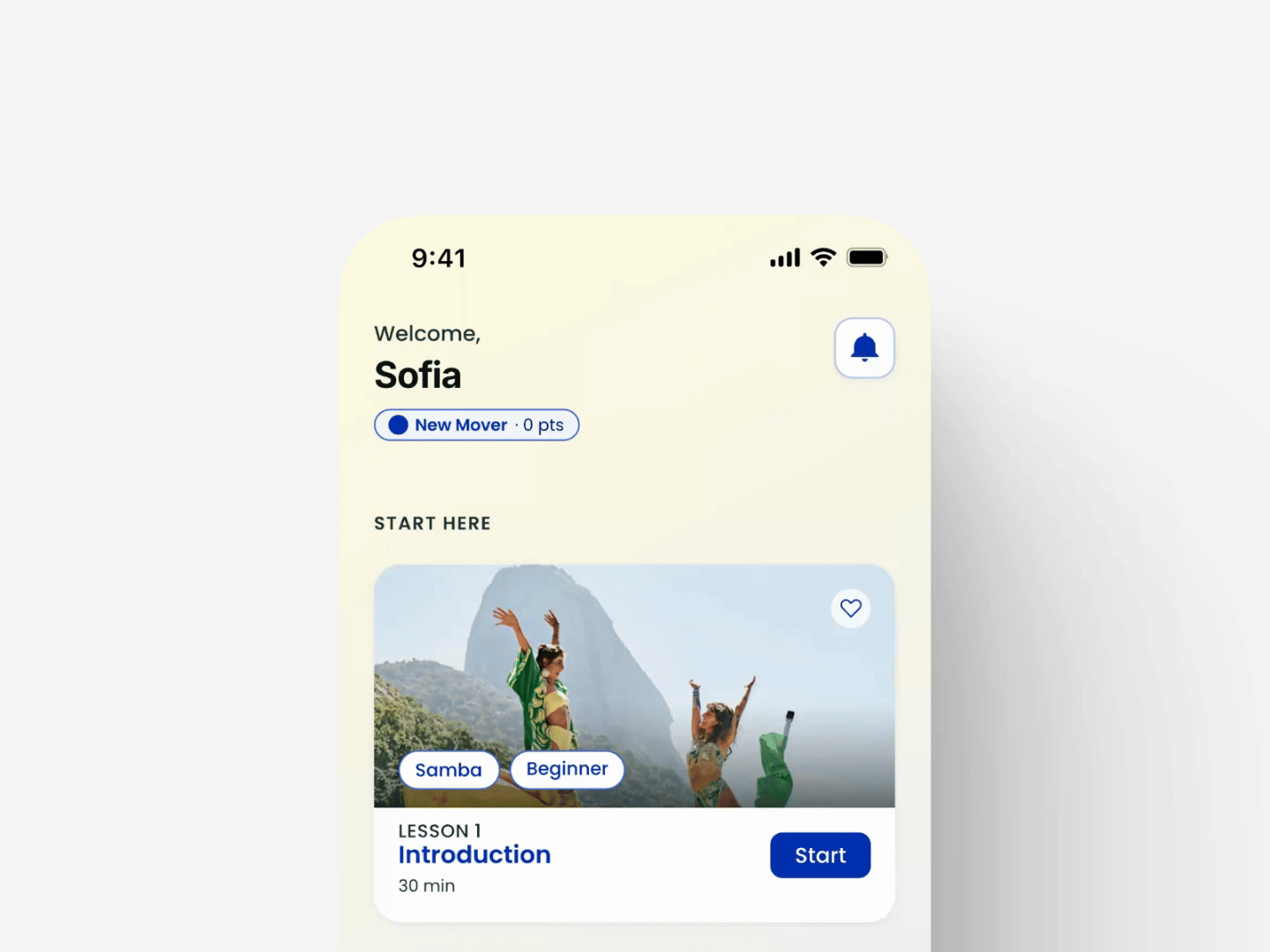
The dashboard contains main elements like ‘next lesson’, community challenges, upcoming events and a prompt that showcases the freemium model. All these elements were marked as priority during research.
Other places AI shaped the work
- Information architecture and user flows
The app serves three user types with different onboarding paths and permissions. Using the ux-design-collaboration skill, I stress-tested the IA with Claude by working through edge cases, access logic, and bifurcation points. We iterated on user flow diagrams using a strict notation system (YES/NO decision diamonds, parallelograms for data input, fill color distinguishing system vs. user actions), which I then translated into Figma. - Copy and microcopy
UX copy was iterated throughout, not added at the end: the onboarding instructional text, the locked content messaging, were all pressure-tested and traceable to a user behavior or research finding. - Client communication
Mariana is a business owner, not a designer. I used Claude to help draft walkthrough scripts and frame rationale in language she could evaluate. The user-testing-report skill shaped usability findings as a narrative that led to decisions, not a list of observations, which made every revision round faster.
What AI did and didn't do
AI accelerated:
- Synthesis and research structuring
- Iteration velocity across wireframes and copy
- Documentation and edge case review
- Translation of decisions into artifacts
AI did not:
- Identify the core navigation problem
- Decide how to structure the content model
- Determine how locked and free content should coexist visually
- Figure out what the brand needed emotionally
Those required understanding the business, the users, and the constraints. The shift wasn't “AI does more.” It was “I spend less time on what doesn't require design judgment, so I have more time on what does.”
A project of this scope would typically require a larger team or a much longer timeline. The AI-augmented workflow is why it didn't.
What testing confirmed
Moderated usability testing validated what research had pinpointed: the orientation gap (users not being able to tell what was free versus membership-locked) was the core driver of drop-off. The Course screen was designed to close it.
Configuration is the whole game
The thing this project made undeniable: when you know how to use it, AI changes the shape of an engagement entirely. Research, IA, wireframing, and copy no longer need to run sequentially: with the right configuration, they run in parallel.
The key word is configuration. Generic prompting gets generic output. The custom skills I built are what made the difference between AI as a novelty and AI as actual infrastructure.