MITTARO
01An email tool that starts with the strategy, not the editor
Mittaro is an AI-first email marketing platform for solo business owners, the people every existing tool assumes already know what to send. As sole Product Designer, I own the product end to end: the research, the architecture, the design system, and the technical specification two engineers are building against heading toward a Q4 2026 beta.




Small business owners shouldn't need a marketing degree
Every email platform sells execution: templates, sends, and automation. They all operate on the assumption that you arrive already knowing your marketing strategy. Solo owners don't. They have a business, but no idea what to send, when, or why.
I decided to bet against the category norm. These users don't need another execution tool to operate; they need one that thinks ahead for them. Mittaro flips the standard workflow: the AI proposes the strategy, while the user reviews, refines, and approves.
The freeze happens at the blank page, not the send button
Talking to solo owners revealed that the primary blocker wasn't a skills gap, it was decision paralysis at the very start. Existing tools hand you an empty editor and wait, leaving owners staring at a void. That reframed the core architectural challenge: instead of building a slightly better editor, Mittaro had to step up first so users could react to a concrete proposal.
Two distinct behavioral mindsets emerged from research that shaped the entire user experience:
- The Delegation Thinker wants the task handled with minimal friction, trusting the output so they can move on to running their business.
- The Confidence-Seeker needs to understand the underlying logic before trusting the software, demanding transparency and control.
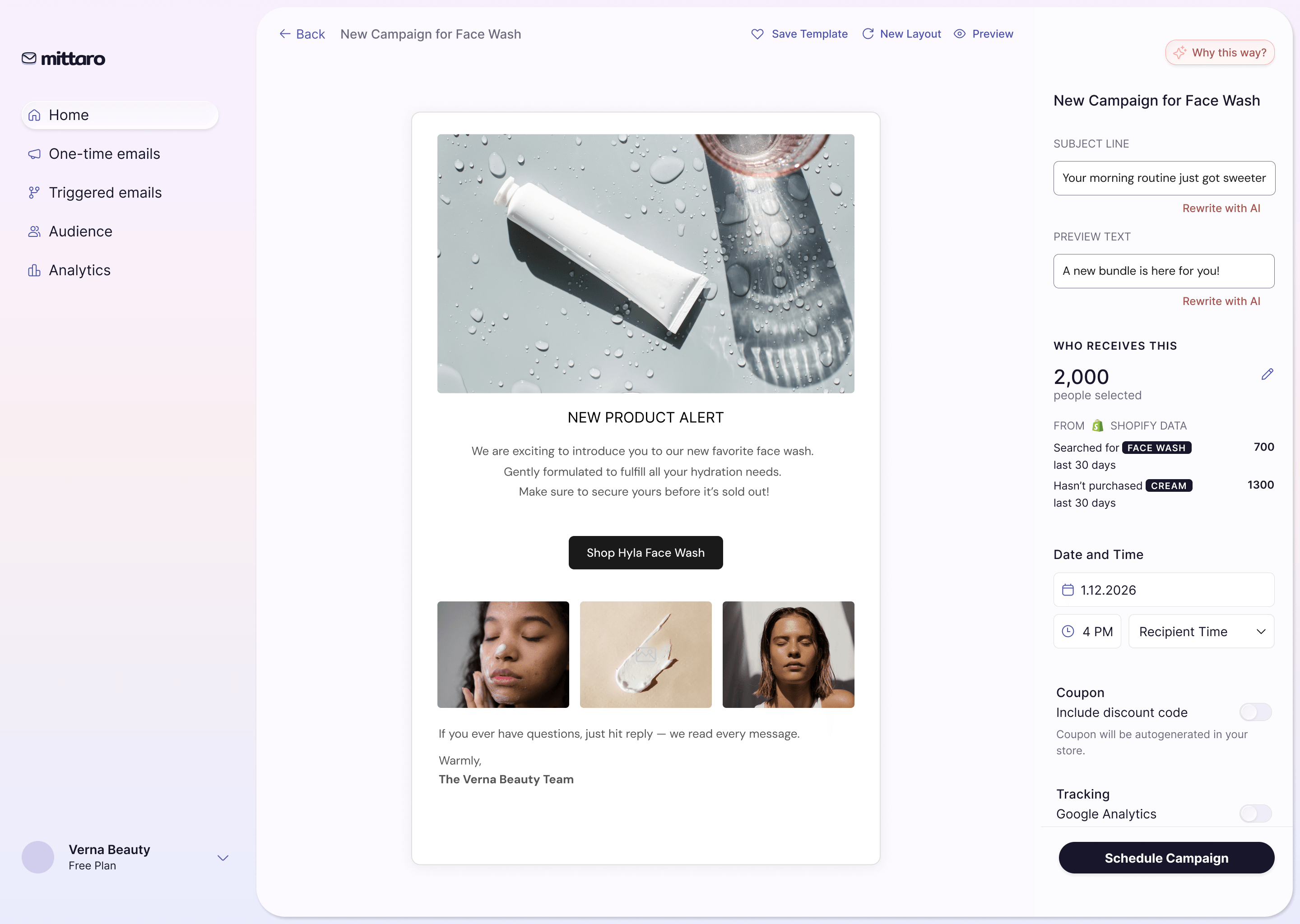
Designing for both required a flexible disclosure architecture: a streamlined, one-click review path for delegators, and expandable reasoning layers for confidence-seekers to inspect why the AI made a specific strategic call.
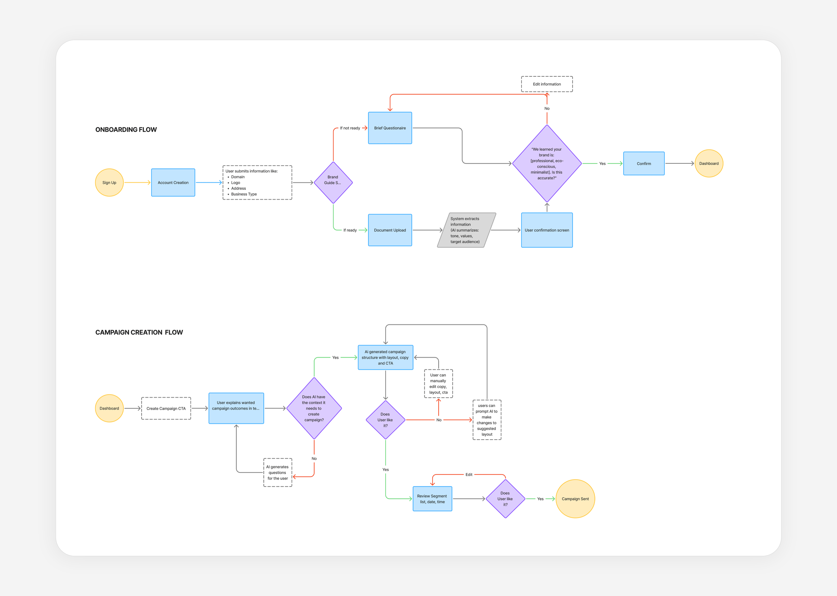
Onboarding and campaign creation flows were mapped to ensure the AI's first proposal arrives before the user meets an empty editor.
Designing a product that speaks first
The AI proposes, it never acts
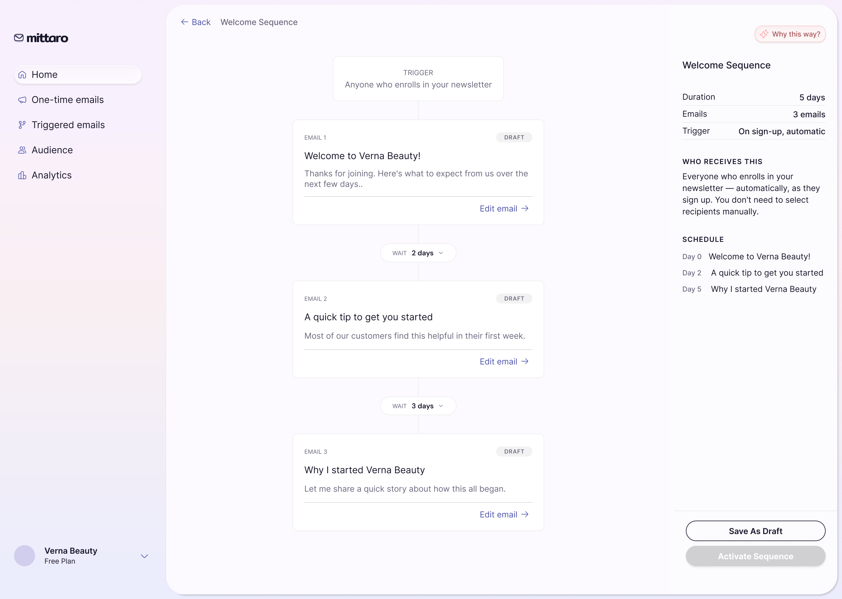
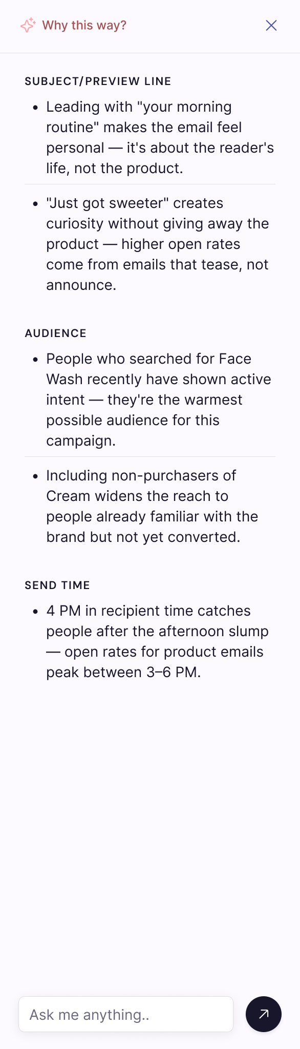
Unchecked AI actions destroy user trust in high-stakes domains like communicating with real customers. I established a non-negotiable principle: nothing sends without explicit, deliberate human approval. That single rule dictated the spatial layout of every screen, shifting focus away from formatting toolbars and toward reasoning panels, live previews, and high-intent confirmation triggers.
One MVP, built around outcomes instead of features
Attempting to solve every email edge case in v1 would dilute the product's core value. I cleanly separated automated triggered sequences from one-time campaigns, aligning the navigation directly with how owners mentally structure their work.
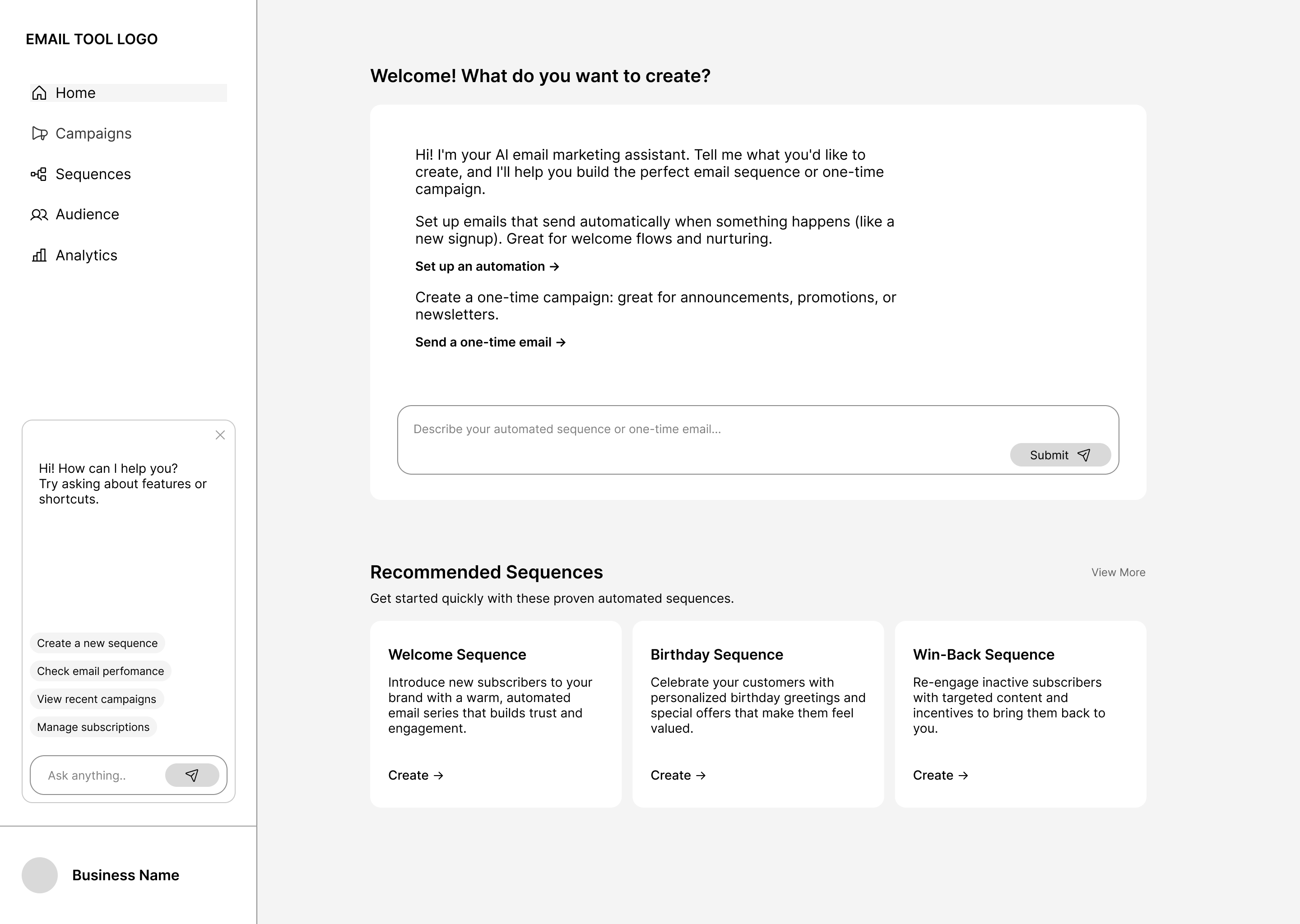
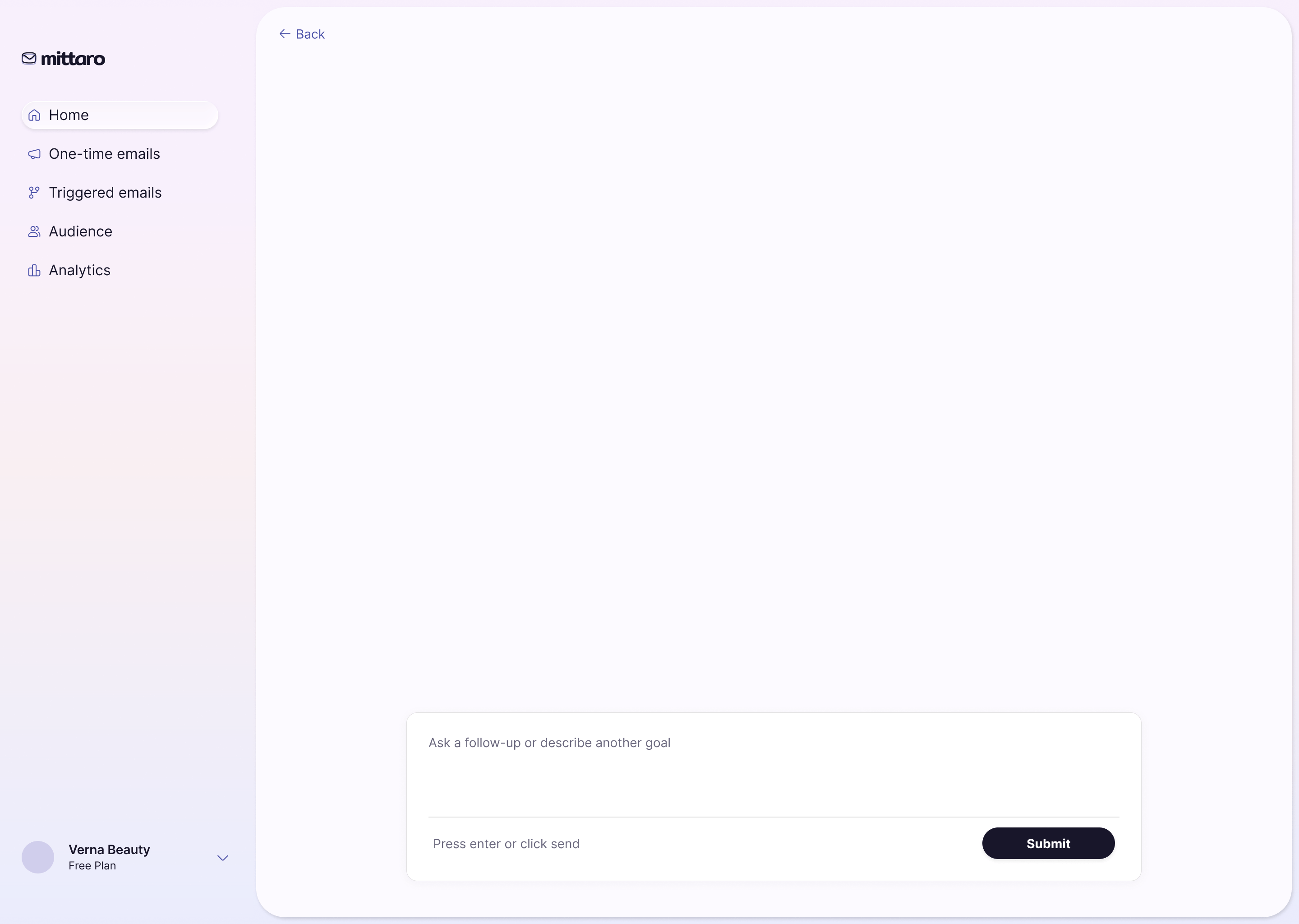
Before and after: the dashboard restructured to align with the user's mental model and make its functionality easier to reach.
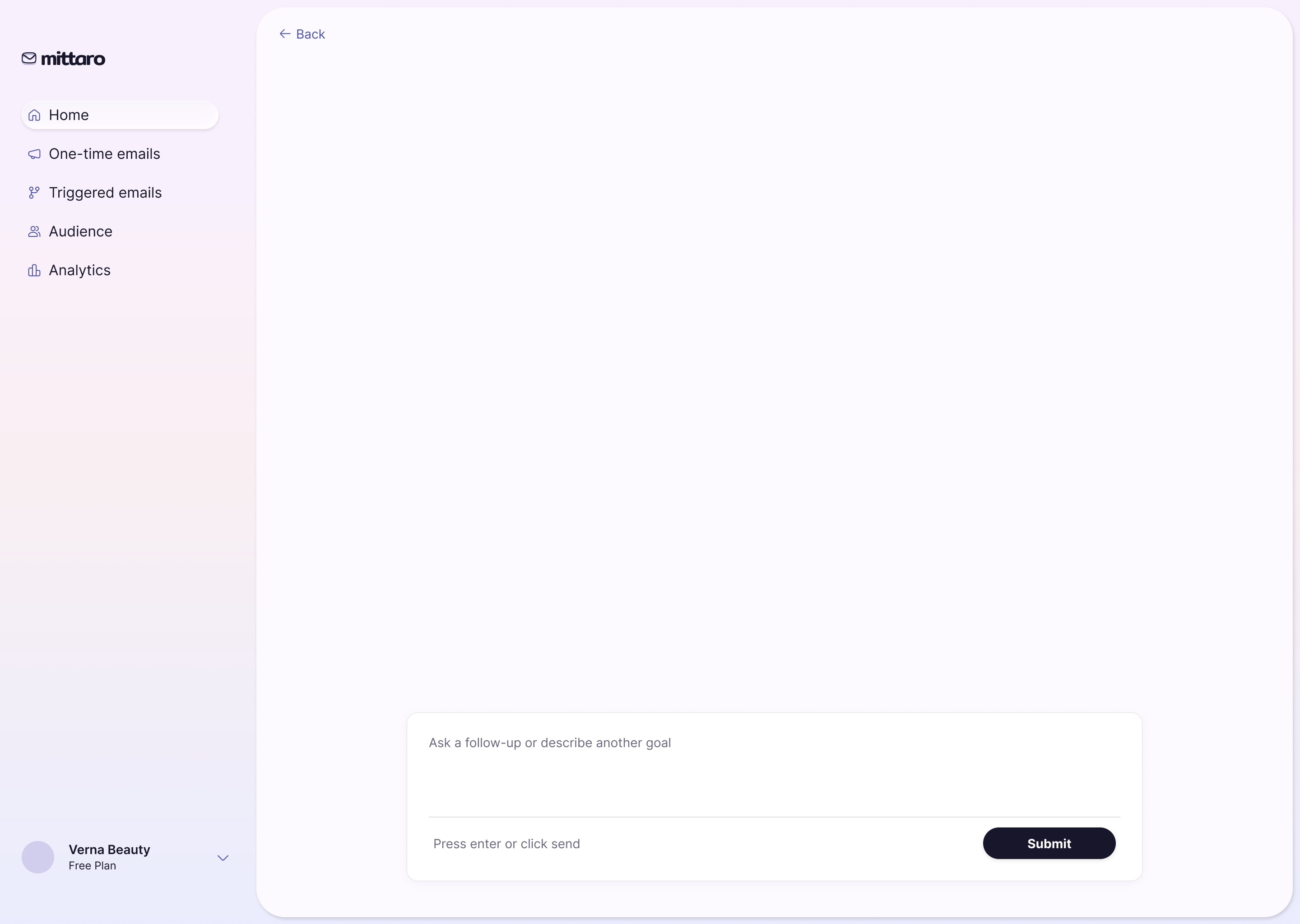
The dashboard as a conversation, not a control panel
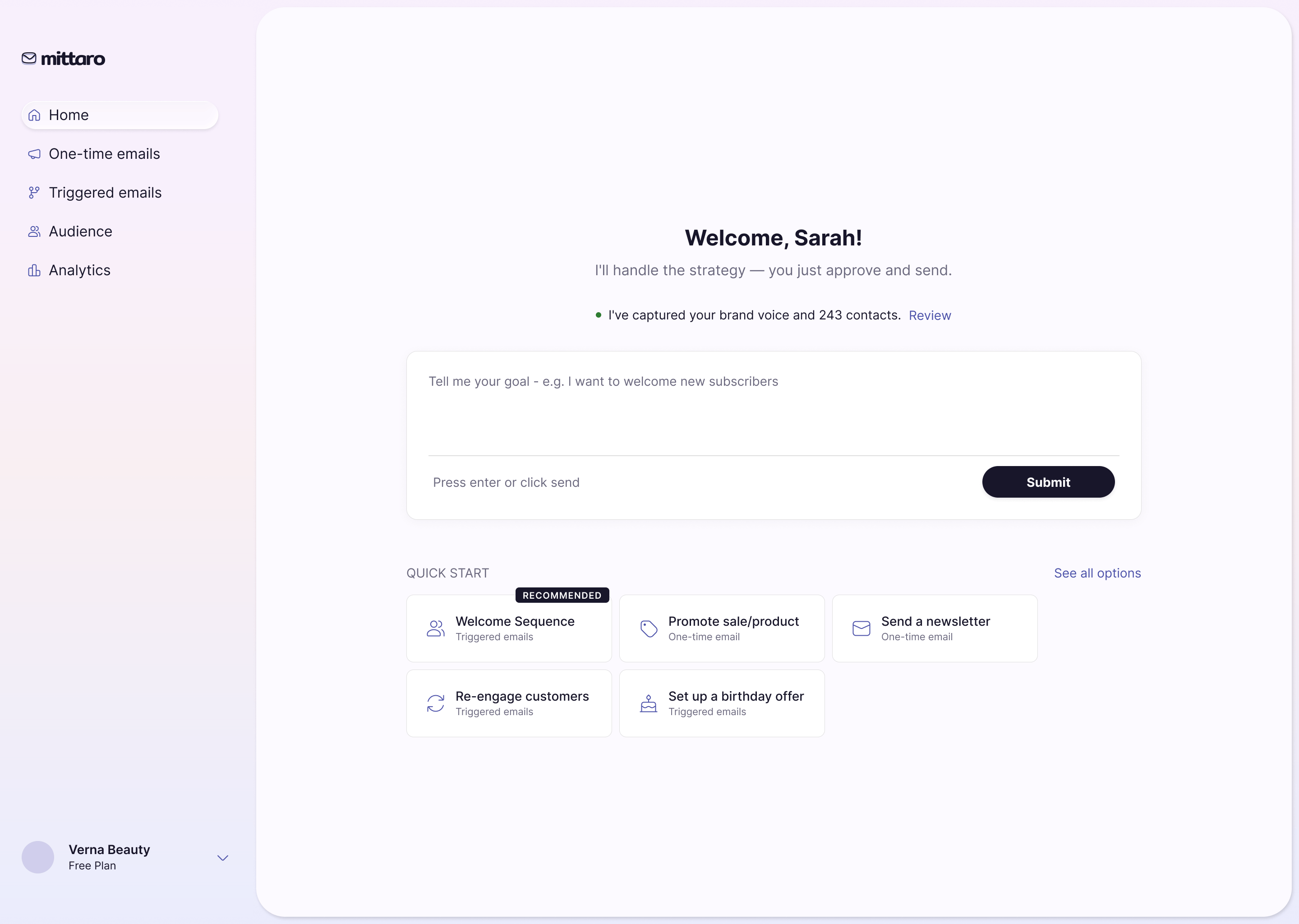
Every competitor opens on a grid of historical metrics, which is useless to someone who hasn't sent an email yet. Mittaro opens on the AI's active strategy feed: here is what to send next, who to target, and why.



An AI product is judged on what happens when the AI is wrong
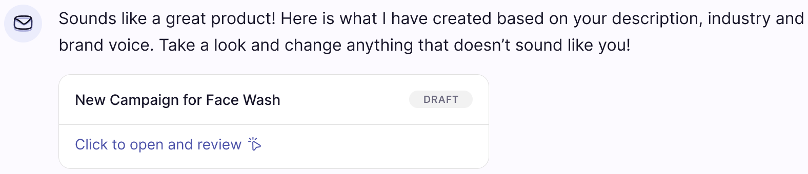
The happy path sells the vision, but failure paths decide whether anyone keeps using the software. I designed three explicit edge-case flows to protect user trust when technology falls short:
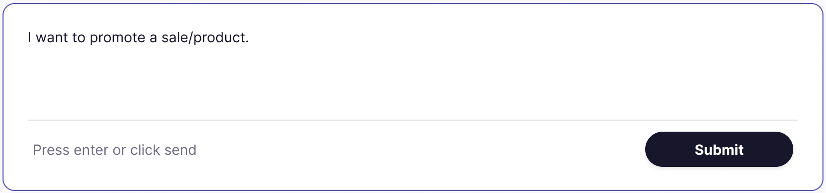
- Off-Target Output: when the AI misses the brand tone, persona alignment, or campaign intent, the user refines parameters directly within the preview instead of starting over. Prompt recovery became a standard edit step in the flow rather than an error screen.
- Perceived Latency: multi-second AI generations feel like frozen software. By streaming generated text progressively behind an active progress badge, waiting reads as real-time reasoning rather than a system hang.
- Hard Failures: API timeouts, rate limits, and context window crashes each receive dedicated recovery states paired with auto-saved drafts, ensuring users never lose work or context during technical outages.
Building the system from scratch
I built the system from scratch because the UI patterns an AI product needs don't exist in standard template kits: panels that explain strategic rationale, confirmation states that make approvals deliberate, and streaming inputs that keep users oriented.
The foundations rely on an Iris violet palette built on token-based color logic, an Inter typography scale, and strict spacing rules. Building on tokens was a critical engineering handoff choice: it allowed two engineers to build straight from the spec without relitigating visual decisions, keeping a one-designer product completely consistent.
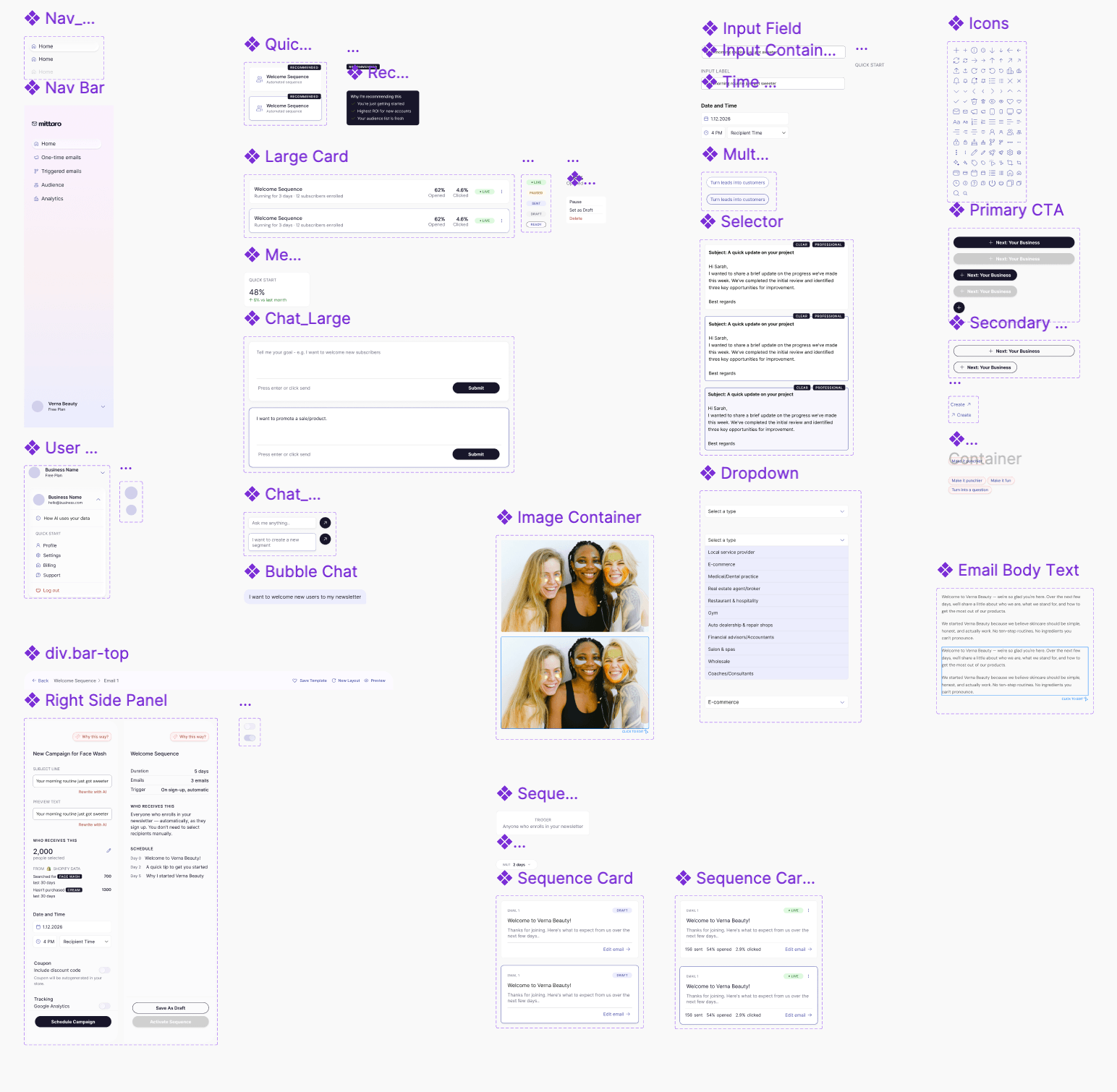
A sneak peek at the component library: every pattern the spec was written against, built from scratch.
Testing changed onboarding, activation and the rationale panel
Moderated usability testing and tree testing on interactive prototypes revealed where user trust broke down, prompting three major structural shifts:
- Onboarding transformed from a static form into an interactive dialogue that asks and listens.
- The Rationale Panel evolved from a dense wall of text into scannable, layered steps so users could absorb the reasoning effortlessly.
- Activation was re-engineered into an intentional, high-clarity trigger to eliminate accidental sends.
My benchmark wasn't just task completion, it was whether a user could explain, unprompted, why they took an action.
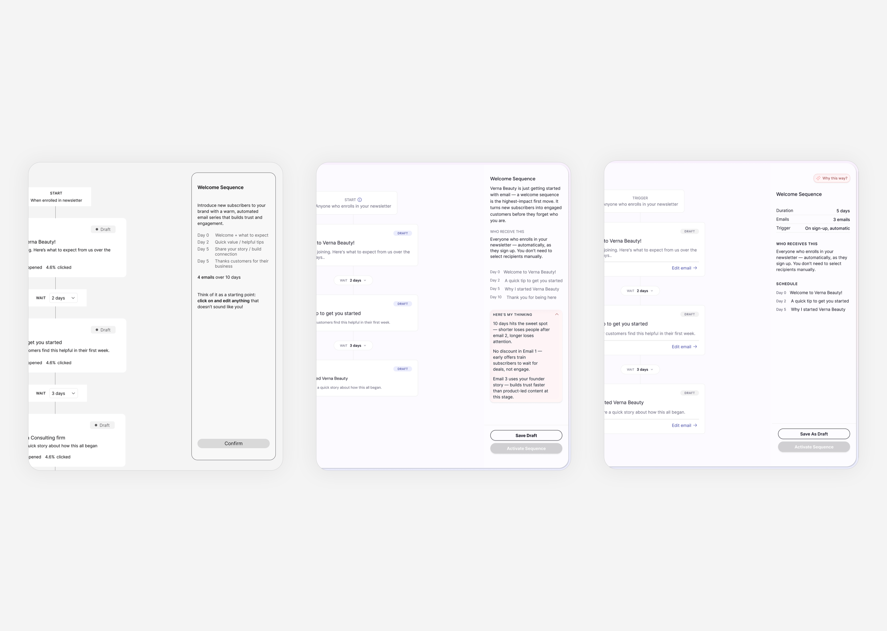
The rationale panel across three rounds: dismissive, then overcrowded, then legible.
Moderated testing and IA findings
85%+ Task Completion
2–3 min Time on Task
3.8–4.2 AI Trust Score
75–80% Tree-Test Success
In an AI product the feature isn't the interface, it's trust
My hardest decisions weren't about visual layout; they were about how much reasoning to disclose, when to require confirmation, and how to make the software's strategy transparent enough that someone feels confident handing over the keys.